

Rush thinks American health care is boffo, but a great graphic making the rounds lately (one originating from National Geographic) says otherwise. Give it a couple minutes of your time — it plots U.S. health care versus the health care of other nations.
Here's all you need to know:
- the left side is the cost of health care per person for each country
- the right side is the average life expectancy for that country
- A country/line in red represents a country without universal coverage (U.S., Mexico) while a country/line in blue represents a country with universal coverage (everybody else)
- the thicker the line, the more people in that country avail themselves of heath care (doctor's visits, etc.)
Click on it to embiggen:
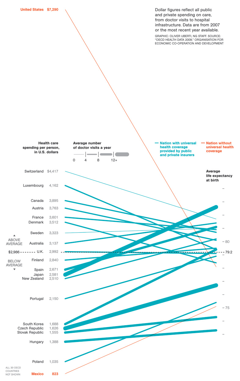
The first thing you'll notice is that Americans spend more — waaaaaay more — on health care than citizens of other countries. And we spend way more even though we don't use health care as much.
And what about the bang for the buck? We actually have a lower life expectancy than most other countries.
Best health care in the world, Rush? By what measurement?