Yesterday, I mentioned the CBO report which showed that Obama's stumulus package saved or created up to 1.2 million jobs, keeping the unemployment rate from going as high as 11% or even 12%.
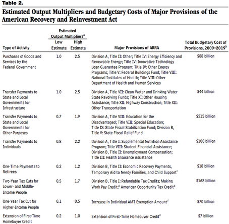
But Ezra Klein dug deep into the report and discovered something else. The report broke down which kind of stimulus actually worked best:
The table above comes from CBO's most recent report (pdf) on the stimulus, by way of Brad DeLong. What you're seeing — and click on it to see it larger — are estimates of the multipliers on various stimulus projects. Estimates, in other words, of how much stimulus the government gets for its dollars. Before we get into it, it's worth tossing this CFRB graph showing the composition of the stimulus package:
Leading the list of high-multiplier items is direct spending by the federal government, infrastructure aid to states and localities, other types of aid to states and localities, and transfer payments (think unemployment insurance and food stamps) to individuals. At the bottom of the list are corporate tax cuts, the new homeowner's tax credit and individual tax cuts.
So in the future, remember this: government spending worked better than tax cuts. Republicans will keep on chanting the "tax cuts are good for stimulating the economy" mantra, but we now can see that they don't provide the bext bang for the buck.

