
In the graphs, the parties are color-coded by the traditional Republican red and Democratic blue. Individual terms are in a lighter shade, and the party average is the darker shade.
Technical note Unless otherwise noted, the figure shown is average annual growth rate for a president’s term, from the year, quarter, or month of inauguration to the quarter or month of the next inauguration. For two-term presidents, results are the averages of both terms.
The bottom line is that, on average, Democratic administrations post better growth numbers, lower unemployment rates, lower federal deficits, higher stock growth, and more equality. It helps explain why Americans have a sense that Democrats are better at economic issues than their Republican counterparts.
But here’s the graphic summaries….
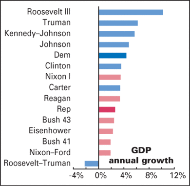
GDP

Strong advantage Dems. Almost down the line, Dems have done better on this metric that Republicans. Even the Carter years weren’t that bad.
Employment

Strong advantage Dems. Like GDP, a clear difference with Democratic all recent Democratic presidents doing better than all recent Republican presidents.
It should be noted that Reagan’s first term, marked by recession, dragged down his average. His second term had an emplotment growth rate of 2.7%, slightly stronger than Clinton’s 8 year average.
Unemployment

Strong advantage Dems. With the exception of Reagan, unemployment has gone up under every recent Republican candidate’s watch, and down for almost every Democrat’s watch. On average, the jobless rate has risen by 1.0 points under the GOP, and fallen by 1.9 points under Dems (–1.3 points if you start in 1949).
Inflation

Slight advantage Republican. Really a mixed bag here, with both parties almost equally split on the zero mark. On average, Democrats preside over a small increase in inflation, and Republicans over a small decrease. The Carter and Reagan administrations are clearly outliers, but the basic truth holds: Republicans are slightly better at curbing inflation.
Deficit/Surplus

Advantage Dems. This might be a surprise to some, as the label of "tax and spend" Democrats seems to have stuck. This term "fiscal shift" means the move toward either a deficit or a larger deficit (negative numbers), as opposed to moving toward a surplus or a larger surplus (postive numbers).
On average, a Republican in the White House has meant a shift of –1.9% of GDP in the government’s budget balance (i.e., towards smaller surpluses or bigger deficits), while a Dem has meant a 1.5% improvement in the budget position (or 1.8%, if you start in 1949, thereby omitting the huge World War II deficit).
This graph, in my view, may not be particularly helpful, as the changes in fiscal shift may come about as the result of tax policies from prior administrations. So keep that in mind.
Stock Market

Slight advantage Dems. The blue years have an edge on stock returns, with the S&P 500 rising an average of 4.7% a year in real terms (price only, excluding dividends, deflated by the CPI) under Democratic administrations, compared with 2.9% under Republicans. (Starting the clock in 1949 raises the Dem average to 6.9%.).
Of course, the stock market doesn’t go up or down based on who occupies the White House; there are tons of other outside factors. But again, it’s a correlative phenomenon which might explain the perception — misguided or not — that the stock market does better (albeit slightly) when a Democrat is in charge.
Bond Market

Strong advantage Republicans. Republicans are a lot more bond-friendly. Real total returns—price plus coupon, deflated by the CPI—averaged +4.2% a year under Republicans, vs. –2.1% under Democrats.
Income Distribution

Strong advantage Democratic. A metric that is near and dear to me. The Gini index is an economic figure which shows the varience in income levels among Americans. For example, if the Gini index is zero, that means that all Americans are making the same income; nobody is richer or poorer than anybody else.
This graph notes the changes in the Gini index under each administration. When the Gini index goes up, that means that the rich get richer while the poor get poorer (i.e., more income inequality) during that adminstration. When it goes down, that mean that there is less income inequality over the course of that administration.
On average, inequality has risen in Republican administrations, and fallen in Democratic ones.
I say this graph shows a "strong advantage for Democrats", but this of course assumes that having less income inequality is a good thing. Some might disagree, and argue that our country should have uber-rich and uber-poor. It all depends on what you want, I guess.
Anyway, food for thought in this election season.