
A very bleak Christmas, spending-wise:
Kevin Drum explans:
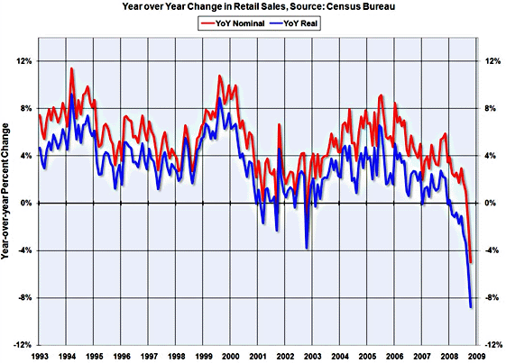
The chart… from Calculated Risk, shows the numbers adjusted for inflation (in blue). Those are the ones that count. Just as it's ridiculous to say that "spending at gasoline stations dropped sharply," as if that's meaningful (people didn't buy less gasoline, after all, they merely benefited from lower prices), it's also ridiculous to claim that overall retail sales were down 4.1% from last year when they were really down nearly 9%. Like it or not, that's a much better indication of how much actual stuff people were buying. (Or not buying, in this case.)