
What the pictograph below is saying is nothing new — we all know that Congress is more polarized now than ever before. But it is a startling visual representation of that fact.
This is from a group of researchers recently in a paper published in PLOS One. They’ve drawn dots for each representative, and lines connecting pairs of representatives who vote together a given number of times. Finally, the dots for each representative are placed according to how frequently the Representatives vote together overall.
What we’re left with is a picture of political mitosis. Similar voting between Democrats and Republicans was fairly common up through the 1980s. But starting in the 1990s the parties began pulling apart from each other, like a single cell dividing into two.
Not only that, but within parties Representatives are voting more similarly too — that’s illustrated with the dots in each party’s cluster becoming more tightly packed together over time. Starting in the 2000s, there are hardly any links between the parties at all.
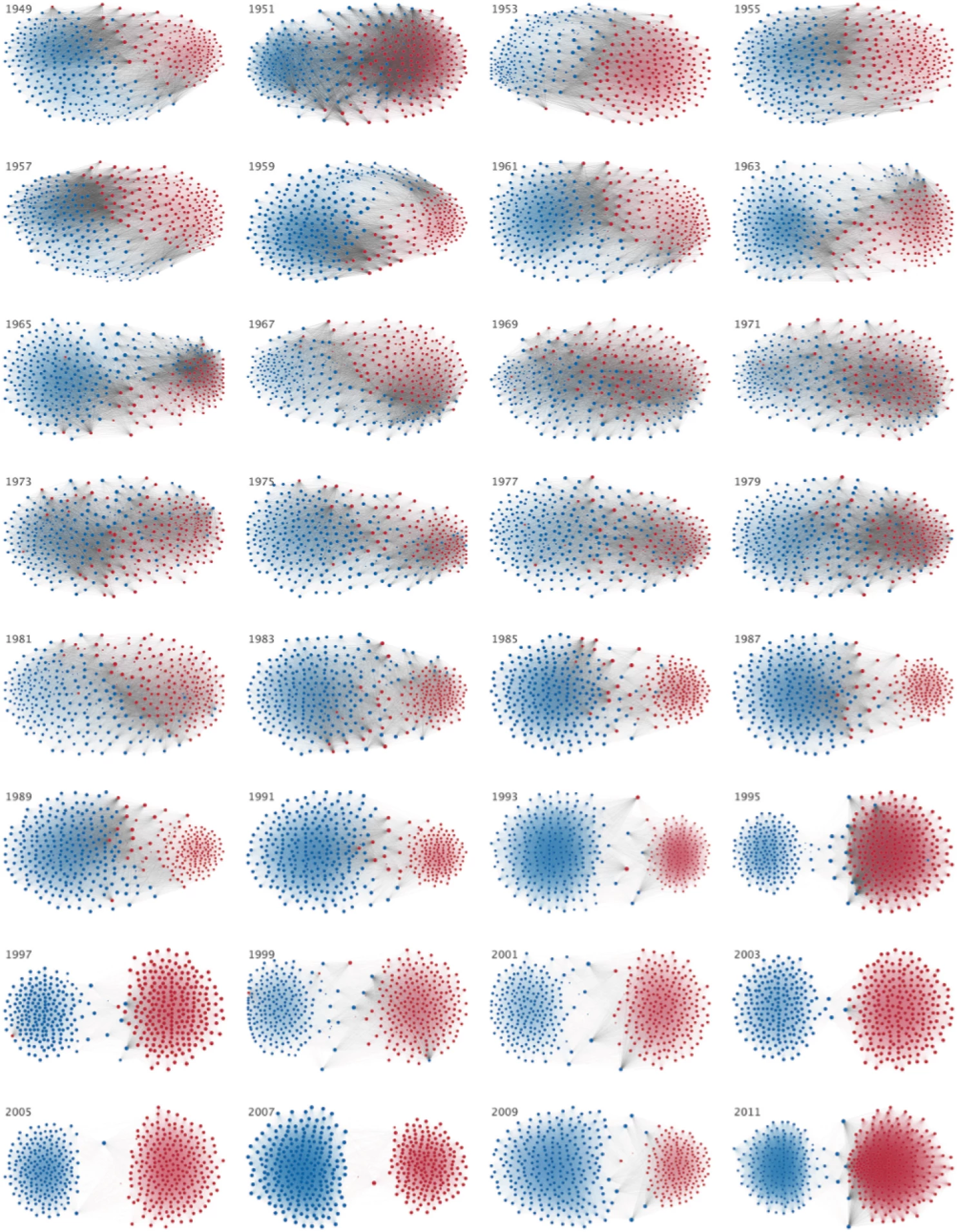
No more liberal Republicans or conservative Democrats. And no more working across the aisle.